Have you wondered why visitors leave your service page without taking action?
Common service page mistakes could be the reason. Your service page is often a customer’s first impression, and small errors can have a big impact.
In this guide, I’ll reveal five red flags that might be scaring customers away—and how to fix them. Let’s make your page work smarter.
Mistake #1: Overloading the Page with Text
Ever land on a page that feels more like reading a novel than browsing a website?
Too much text can overwhelm visitors and make it hard for them to find the information they actually need. People don’t want to dig through paragraphs—they want quick, scannable answers.

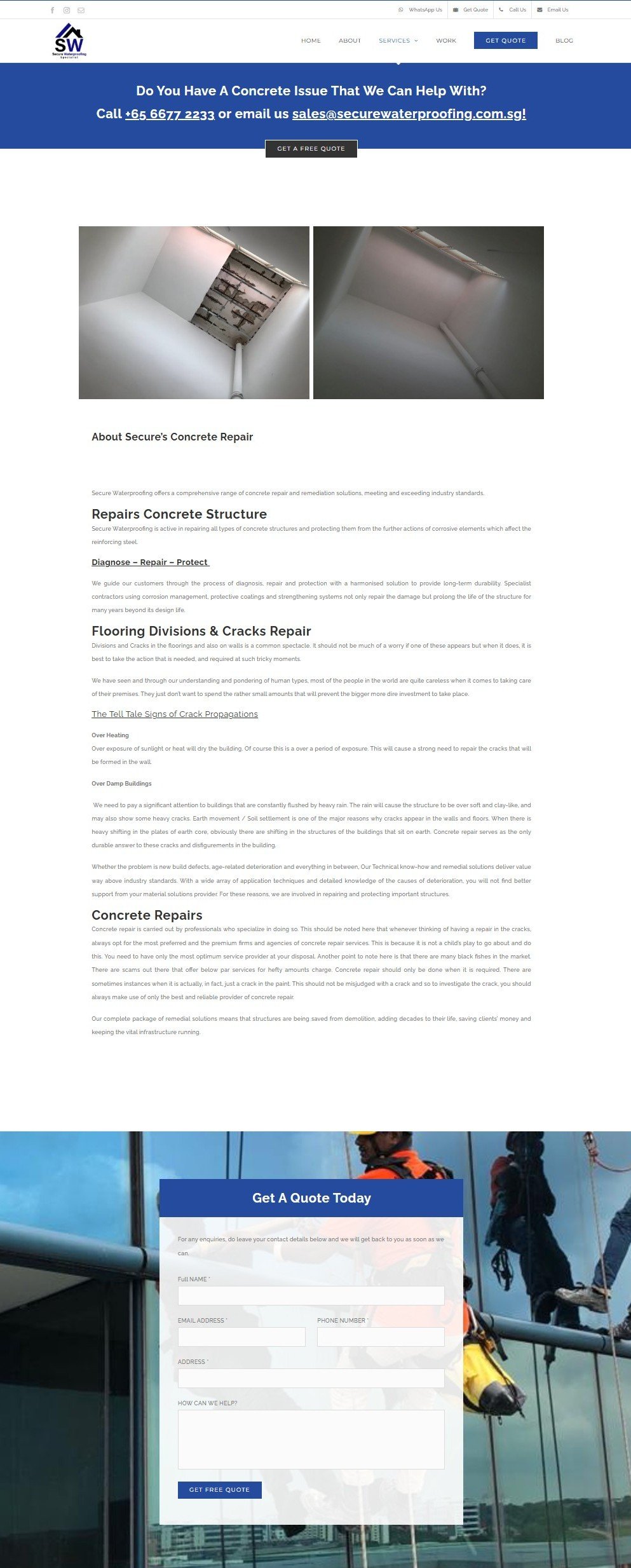
Wall of text
Why It Scares Customers:
How to Fix It
Takeaway
Less is more when it comes to content—keep it simple, clear, and easy to read. A well-structured page shows your customers you value their time.
Mistake #2: Confusing or Vague Messaging
If your service page doesn’t clearly explain what you do and how you can help, visitors will quickly lose interest. Your audience is looking for clarity—fast. If they have to guess what you offer or wade through jargon to understand, they’re more likely to hit the back button than stick around.

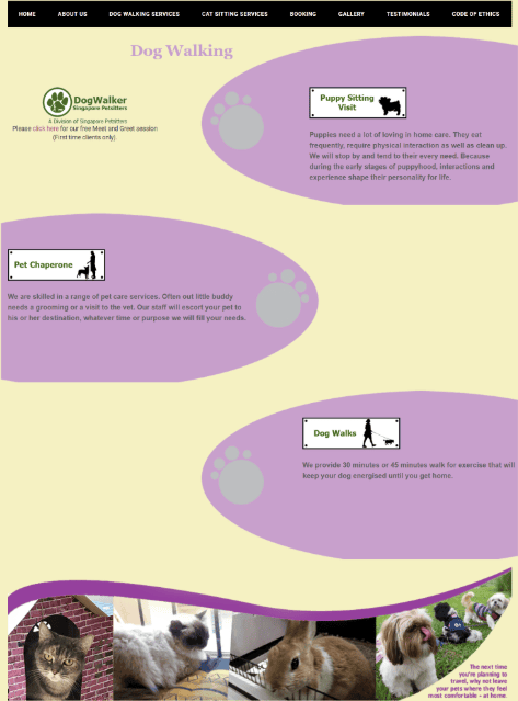
The tone is casual and playful, but it's not immediately clear who the audience is. Is this aimed at families, young adults, or a broader demographic? While "family vibes" are mentioned, the rest of the text leans toward a more youthful, quirky tone.
Why It Scares Customers:
How to Fix It
Takeaway
Clear, direct messaging shows visitors that you understand them. When people feel understood, they’re more likely to trust you—and choose your business.
Mistake #3: Lack of Trust Signals
Imagine landing on a service page with no reviews, testimonials, or proof of past work. Would you feel confident hiring that business?
For most people, the answer is no. Without trust signals, visitors may question your credibility and hesitate to move forward.

No social proof
Why It Scares Customers:
How to Fix It
Takeaway
Trust is earned, and your service page is where it starts. Adding these signals shows visitors that they’re in safe, capable hands.
Mistake #4: Poor or Missing Call-to-Actions (CTAs)
A service page without a clear next step is like a road without signs—confusing and frustrating.
If your CTAs are hard to find, unclear, or missing altogether, visitors won’t know what to do next. And when they’re unsure, they’re more likely to leave.

What should the visitor do next ?
Why It Scares Customers:
How to Fix It
Takeaway
A strong CTA acts like a guide, gently nudging visitors toward the action you want them to take. Without it, even the best service page can fall flat.
Mistake #5: Outdated or Unprofessional Design
First impressions matter, and your service page is no exception. If it looks outdated, cluttered, or poorly designed, visitors may assume your services are just as unpolished.
A professional, modern design helps establish trust and credibility right away.
Outdated year
Why It Scares Customers:
How to Fix It
Takeaway
A well-designed service page isn’t just about looks—it shows your customers you’re professional, trustworthy, and ready to deliver.
Mistake #6: Talking Only About Yourself
Ever read a service page that feels like one big brag?
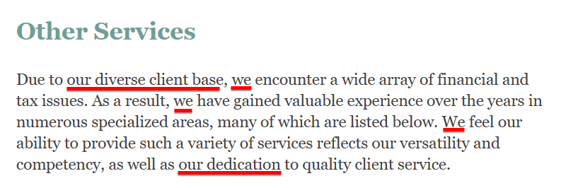
“We do this.” “Our team is amazing.” “We’re the best at what we do.”
While confidence is important, making your page all about you—and not about your customers—is a fast way to lose their interest.

Bragging
Why It Scares Customers:
How to Fix It
Takeaway
Remember, your service page isn’t about showing off—it’s about showing up for your customers. Speak to them, not at them, and they’ll stick around.
Wrapping Up
Your service page can do one of two things: attract customers or push them away.
It all comes down to the details.
The good news? Fixing those red flags is easier than you think. With a few smart changes, your page can go from “meh” to magnetic. It can pull in visitors and turn them into loyal customers.
Ready to make it happen? The service page builder kit has everything you need. Grab it today and start seeing real results.

